
Are you ready to delve into the world of Pokémon GO and its design secrets? We’re about to uncover how this beloved smartphone app shines when it comes to being user-friendly, even for those unfamiliar with game development intricacies.
In our daily hustle, we interact with countless products, some forgettable, others indispensable. Think about those moments fumbling with a stove or pressing the wrong button online—we’ve all been there. But then there are those exceptional products that just click, like your favourite chair or that addictive gaming app.
Enter the world of usability and user experience (UX). Usability is all about how easily and effectively we can use a product to achieve our goals, while UX encompasses how enjoyable and engaging that experience is. Picture a coffee machine that not only brews the perfect cup but also looks sleek and feels great to operate—that’s high usability and a fantastic user experience.
Usability is a measure of how well a specific user in a specific context can use a product/design to achieve a defined goal effectively, efficiently and satisfactorily. Designers usually measure a design’s usability throughout the development process—from wireframes to the final deliverable—to ensure maximum usability.
To measure usability, we turn to Nielsen’s 10 usability heuristics—rules of thumb guiding product development since 1994. These principles are like guiding stars for designers, ensuring products are user-friendly.
Now, let’s examine how Pokémon GO nails these usability heuristics. From keeping you informed during battles to speaking your language with familiar concepts, Pokémon GO excels.
Visibility of System Status
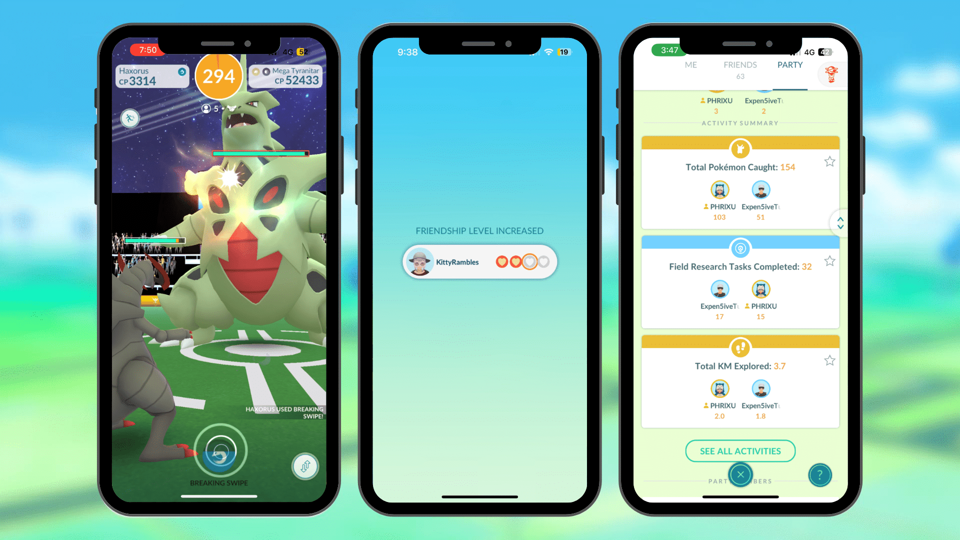
Take the ‘Visibility of system status’ heuristic, for instance. In battles, it’s crystal clear—your Pokémon’s attack charge, opponent’s health status, attack effectiveness, and fight duration are all neatly displayed.
Even when interacting with friends, the app makes it easy to understand friendship levels, whether you have exchanged gifts, interaction for the day and even adds details to help you feel close to them such as their most recently caught Pokémon.
During parties you can see your individual progress towards each task, and who is in your party. However, one slight downfall is that there is currently no timer to see how long left you have in the party.
Match between system and the real world
Consistency and standards
Users shouldn’t have to second-guess whether different words, situations, or actions carry the same meaning. It’s crucial to stick to established conventions within the platform and industry.
Consistency reigns throughout the entire system, from uniform colours and shapes to a cohesive language. This consistency is evident not just in background colours or button designs but also in uniform typography. There are some cases where button design is not consistent, and this generally sticks out.
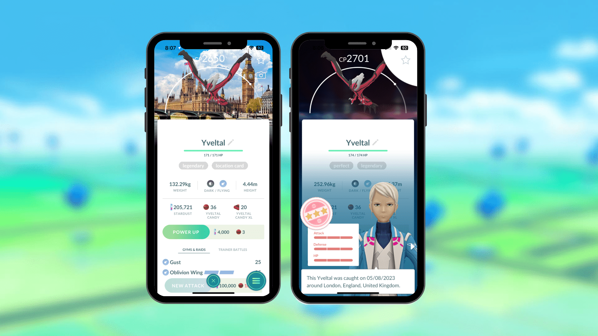
Look at the Pokémon screen displaying a single captured Pokémon – it’s another illustration of a well-organised interface. Clear information is presented uniformly, with consistent fonts and identical buttons, offering a serene and coherent display. Each Pokémon maintains the same layout, and even the terminology (“stardust,” “candy,” “CP”) remains consistent throughout the entire game.
User control and freedom
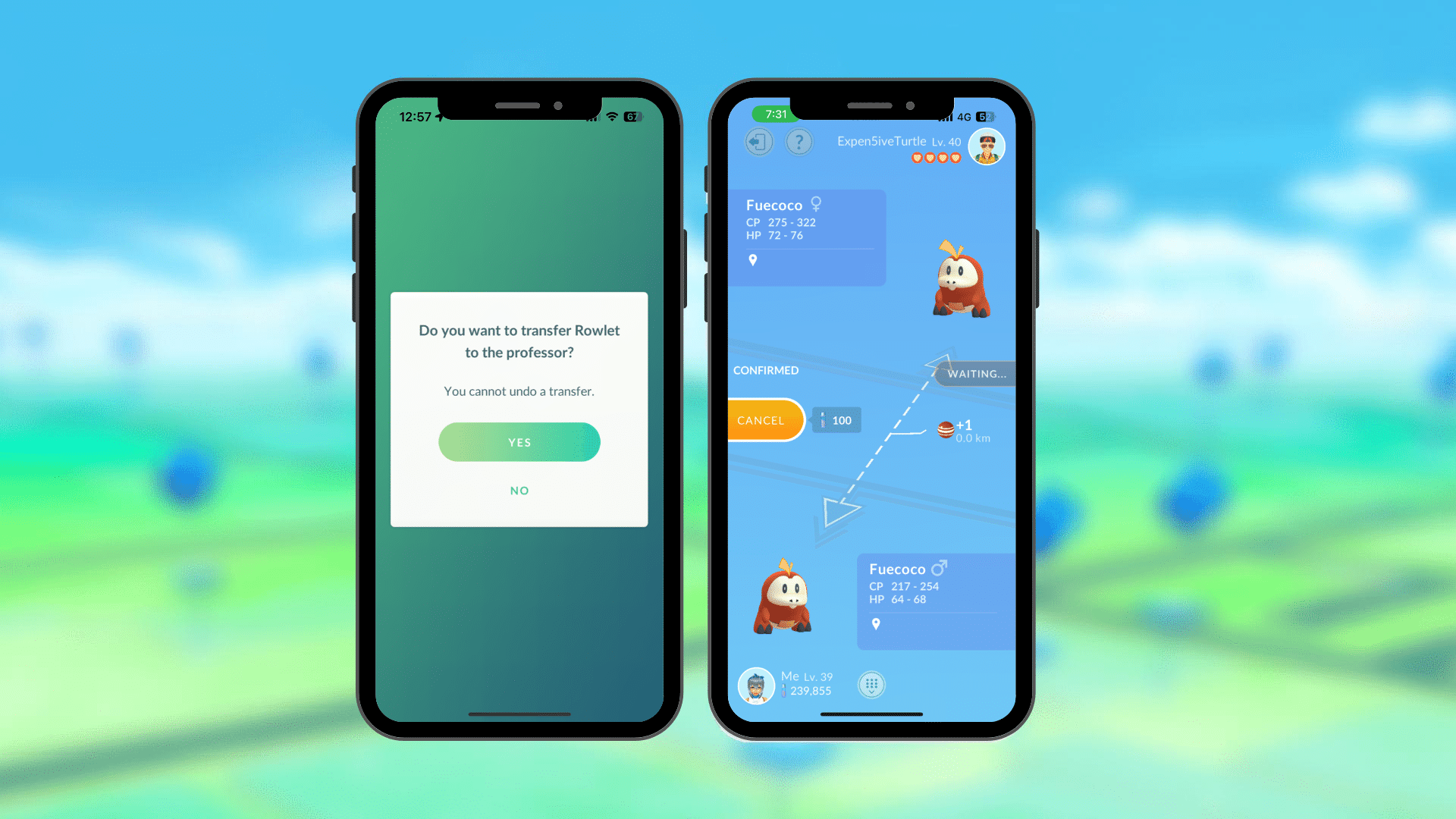
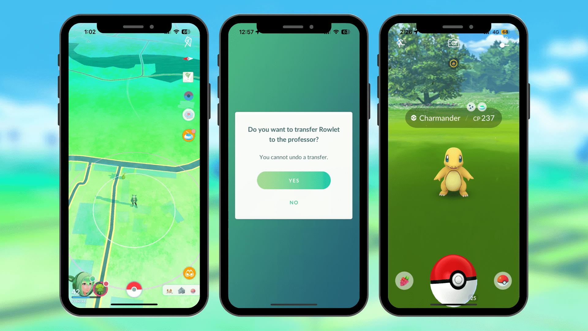
The app’s ‘User control and freedom’ aspect is impressive too. It’s hard to make mistakes, with well-placed confirmation pop-ups. Whether in battles or managing your Pokémon, there’s always an exit option or confirmation pop-up to avoid accidental actions.
As a result the new avatar update, multiple new hair styles and lengths have been added. Your avatar’s body shape can be fully customised and now we have access to both ‘masculine’ and ‘feminine’ options of each avatar item. This freedom not only ties into match between system and real world, as the avatar can more closely reflect the Trainer’s appearance in real life but gives us a world of opportunities for customisation!
Recognition rather than recall
Consistency is key in the app’s ‘Recognition rather than recall’ principle. From item symbols to Pokémon screens, the design maintains a uniform language, making it easy to navigate and understand.
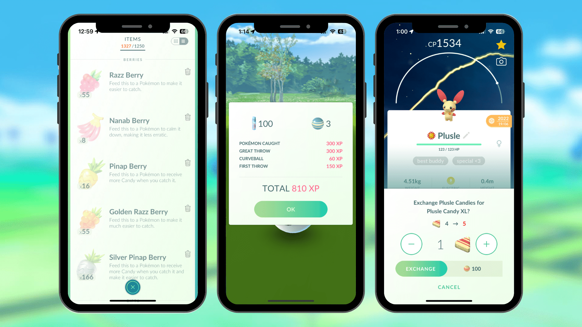
The term ‘candy’ with its icon is used consistently throughout the game from the post-catch-screen, description of Pinap Berry use to powering up or trading for XL Candies. This consistency allows users to learn all aspects of the game rather than remembering a series of actions.
For example, named items in the game make reference to objects we may have encountered before through fiction, experiences or other games, such as Potions used for healing.
Flexibility and efficiency of use
Shortcuts, often concealed from novice users, serve to expedite interactions for experienced users while accommodating both inexperienced and adept users. Allowing users to personalise frequent actions is key.
In Pokémon GO inventory management, assigning nicknames to Pokémon aids users in sorting and locating them efficiently. This not only streamlines finding specific Pokémon or reducing their names but also adds a personal touch. Search strings are used to quickly identify specific Pokémon and can be saved for future use. This flexibility doesn’t just enhance gameplay; it significantly boosts efficiency, especially for users managing a large collection of Pokémon.
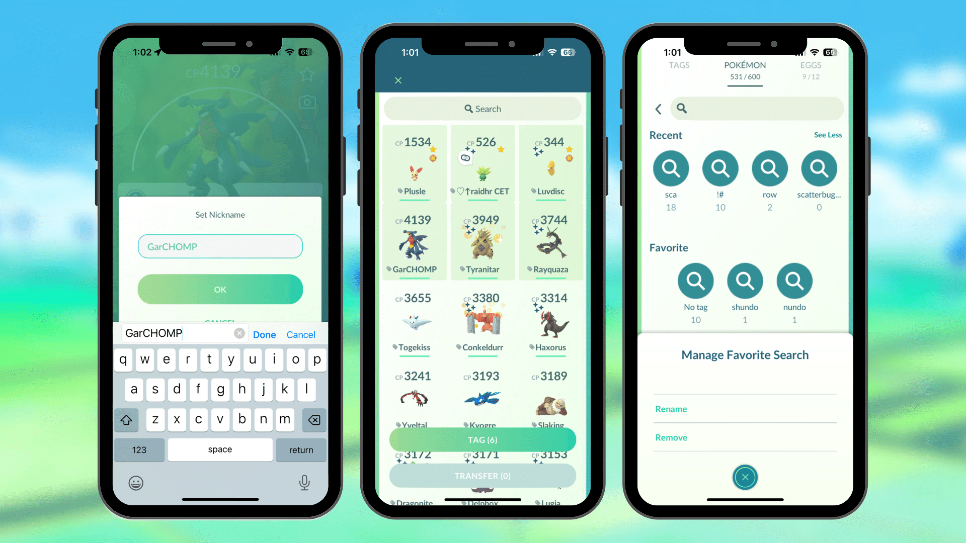
A familiar feature seen in various application is multiselect. This functionality enables users to mark several Pokémon for collective actions like tagging or transferring them together. This shortcut greatly streamlines the process of sending multiple recently caught Pokémon simultaneously, eliminating the need for individual actions and enhancing overall efficiency for users.
A fairly recent QoL update has been the ‘heal all’/’revive all’ option which streamlines relobbying during raids and saves valuable seconds within general gameplay. A huge UI win!
Error prevention
And let’s not forget ‘Error prevention’—Pokémon GO prevents accidental transfers of your prized Pokémon with simple but effective features like favouriting and confirmation pop-ups when transferring Legendaries, Buddy Pokémon, shinies or XXL/XXS ‘mon.
Aesthetic and minimalist design
The app’s ‘Aesthetic and minimalist design’ keeps distractions at bay, focusing your attention on what matters—the Pokémon themselves and the action of catching them.
The game does this well by keeping all extra info or actions hidden in tabs accessible from the bottom of the screen, or icons along the right-hand side of the screen.
In certain parts of the game, you might encounter confirmation prompts for actions. To streamline this process, any unnecessary details or distractions are cut out. The background is simplified and overlaid, the question becomes concise and straightforward, and the options are clear and precise.
The core of catching Pokémon revolves around two key elements: the Pokémon itself and the Pokéball. Alongside these, there are the catching circles and a subtle background dependent on your location. Despite the colorful and dynamic screen, the focus remains fixed on the essential aspect: catching the Pokémon. This reduction in elements doesn’t diminish the gameplay enjoyment; instead, it enhances the focus on the primary objective.
Help users recognise, diagnose and recover from errors
Error messages need to communicate in clear, understandable language without relying on error codes. They should accurately pinpoint the issue and offer constructive solutions.
Throughout the game, users receive helpful advice from your team leader at strategic moments. For instance, after a battle loss, the mentor offers tips on attack effectiveness. This guidance aims to assist players in choosing more effective Pokémon for future battles, increasing their chances of winning.
Help and Documentation
Ideally, the system should be intuitive without requiring extra guidance. Yet, providing documentation might be essential for users to grasp certain tasks particularly if Trainers are new to the world of Pokémon.
Throughout the app, question mark icons offer assistance, explaining concepts like raid battles for new users. It’s crucial that this information is contextually provided, aiding users precisely when they need it.
During GO Rocket Battle team selection, a help button lets you know the opponent Pokémon’s weakness and what type does super-effective damage against them. This keeps the gameplay fun, as new players struggle less with these aspects of the game.
Summary
But what makes Pokémon GO truly exceptional? It’s the continuous evolution and updates. The game never stands still, constantly improving based on user feedback, keeping players engaged and excited. Even since I wrote this article we have had multiple QoL updates which could be included throughout – can you spot any I’ve missed?
In essence, Pokémon GO not only entertains but also taps into fundamental human desires, making it an addictive, fulfilling experience. It’s a testament to how integrating usability principles can elevate a product and captivate its audience.
So, the next time you’re out there catching Pokémon, know that behind the fun lies a meticulously designed, user-friendly experience that keeps you hooked.